EO Brand Design
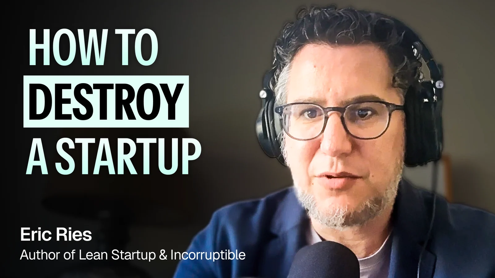
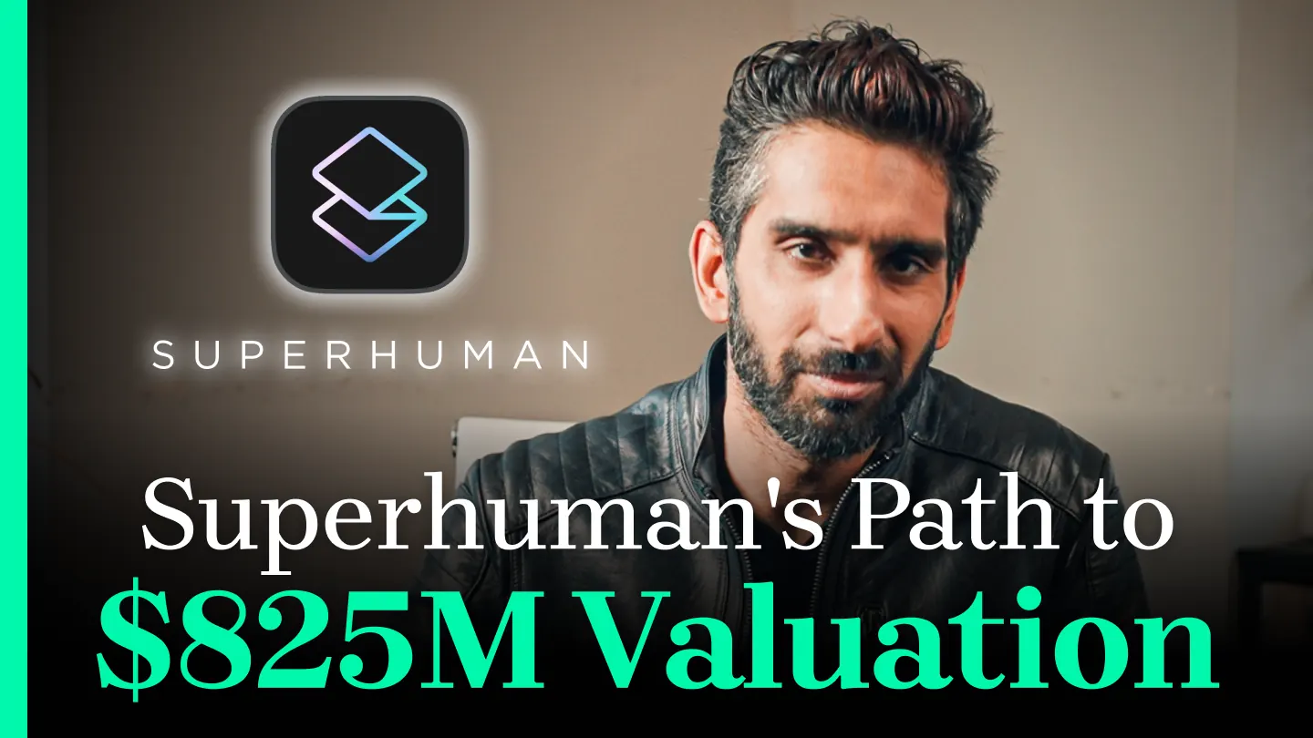
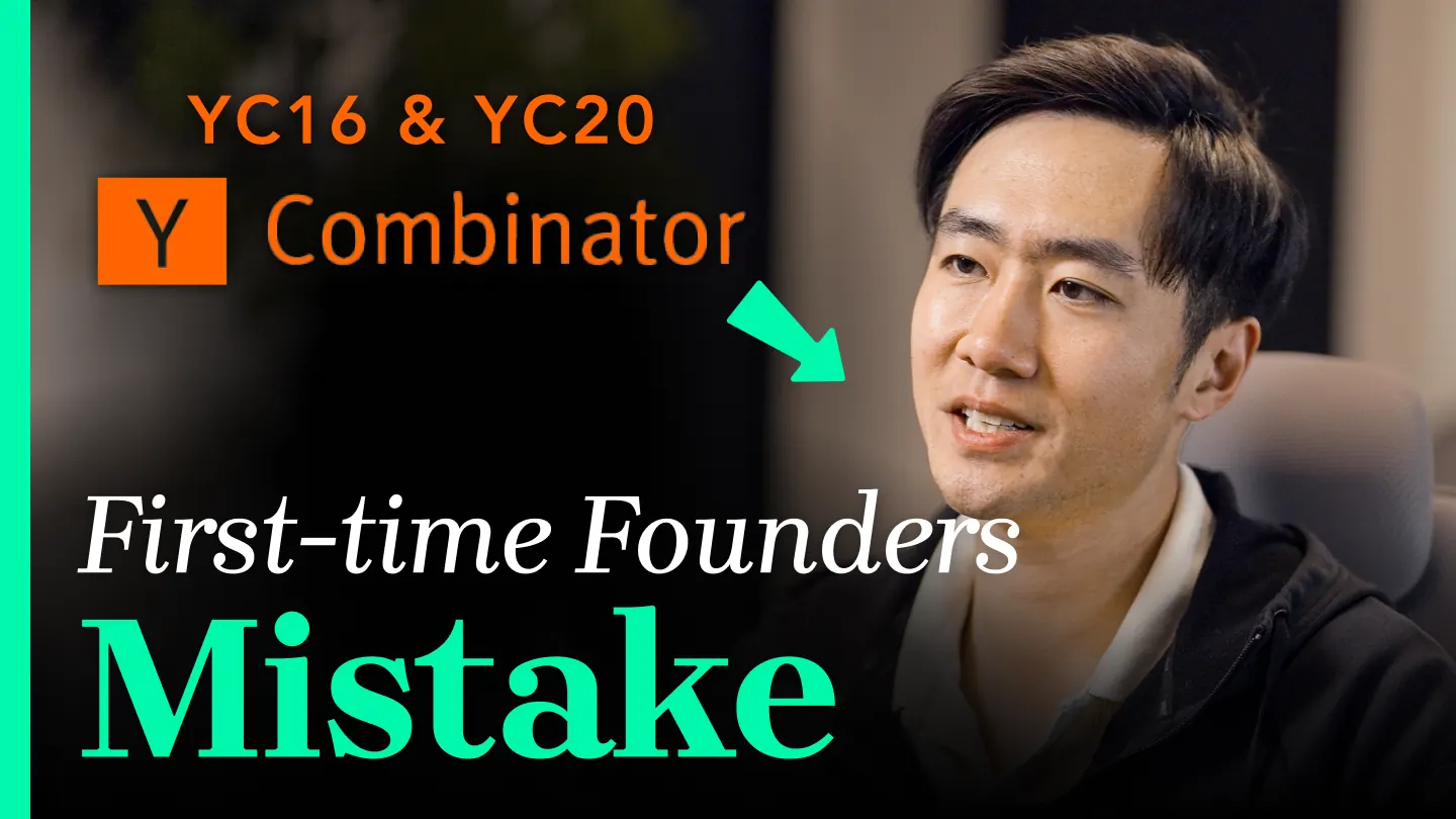
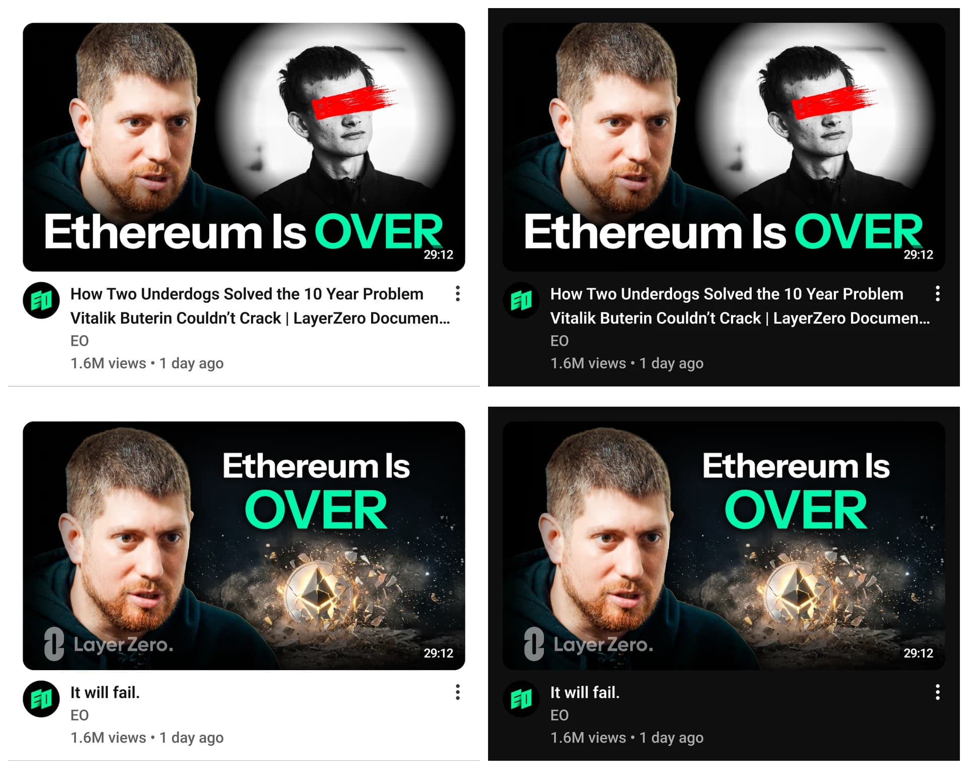
Thumbnails, mid rolls and social formats. Hand-made to automated.
- Role
- Design, systems
- Surfaces
- Thumbnails, mid rolls, social
Background
EO publishes every day in two languages, through in-house designers, freelancers and an offshore edit team. Three surfaces carry the brand: the thumbnail, the mid roll, the social post. Most are made by other hands.
1. Thumbnails
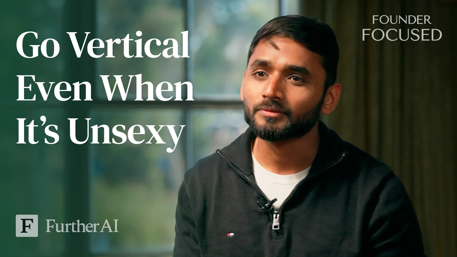
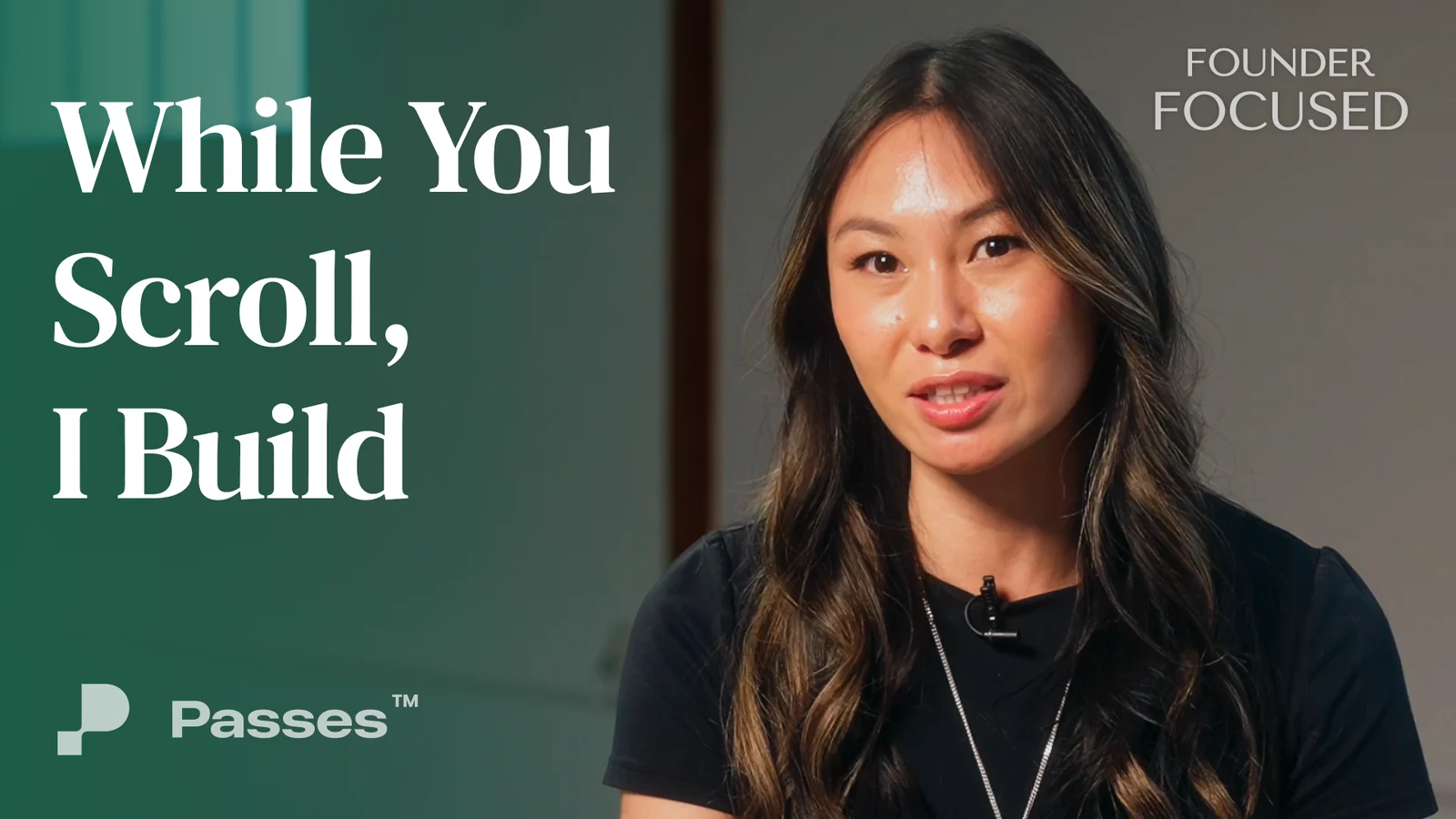
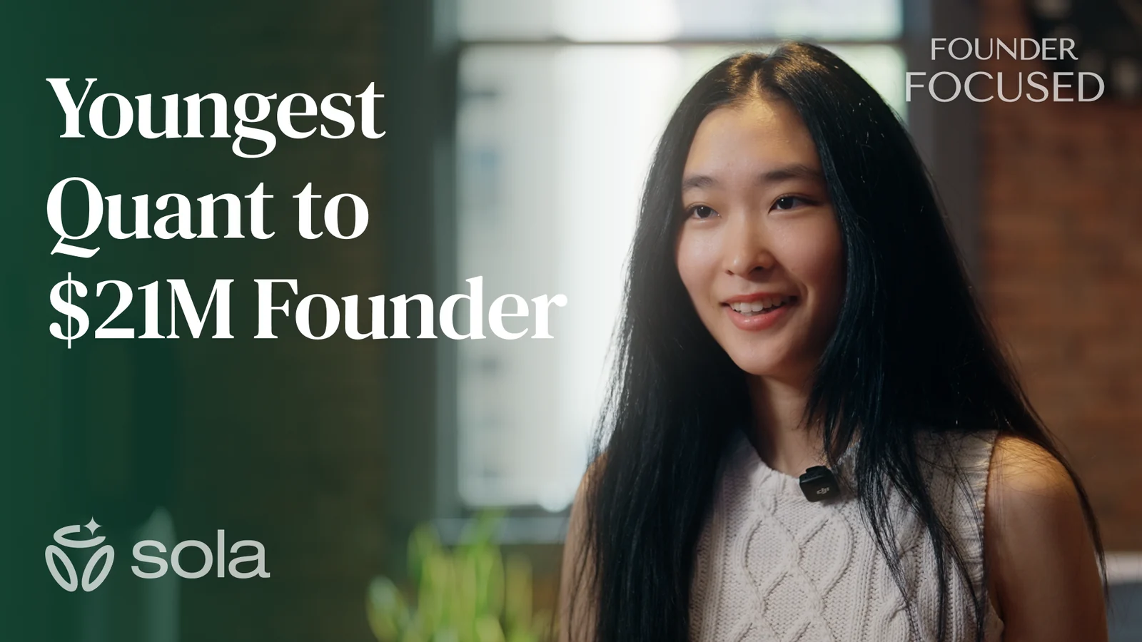
A Figma component renders each one inside the real YouTube UI before it ships. Two automations handle throughput: a request opens a pre-filled Linear issue, and published thumbnails archive to Drive.

2. Mid rolls
Mid rolls run inside every EO Global episode. Two of the ones I directed: the magazine's own spot, and a Granola collaboration built around how EO's producers use it.
3. Magazine covers and OG images
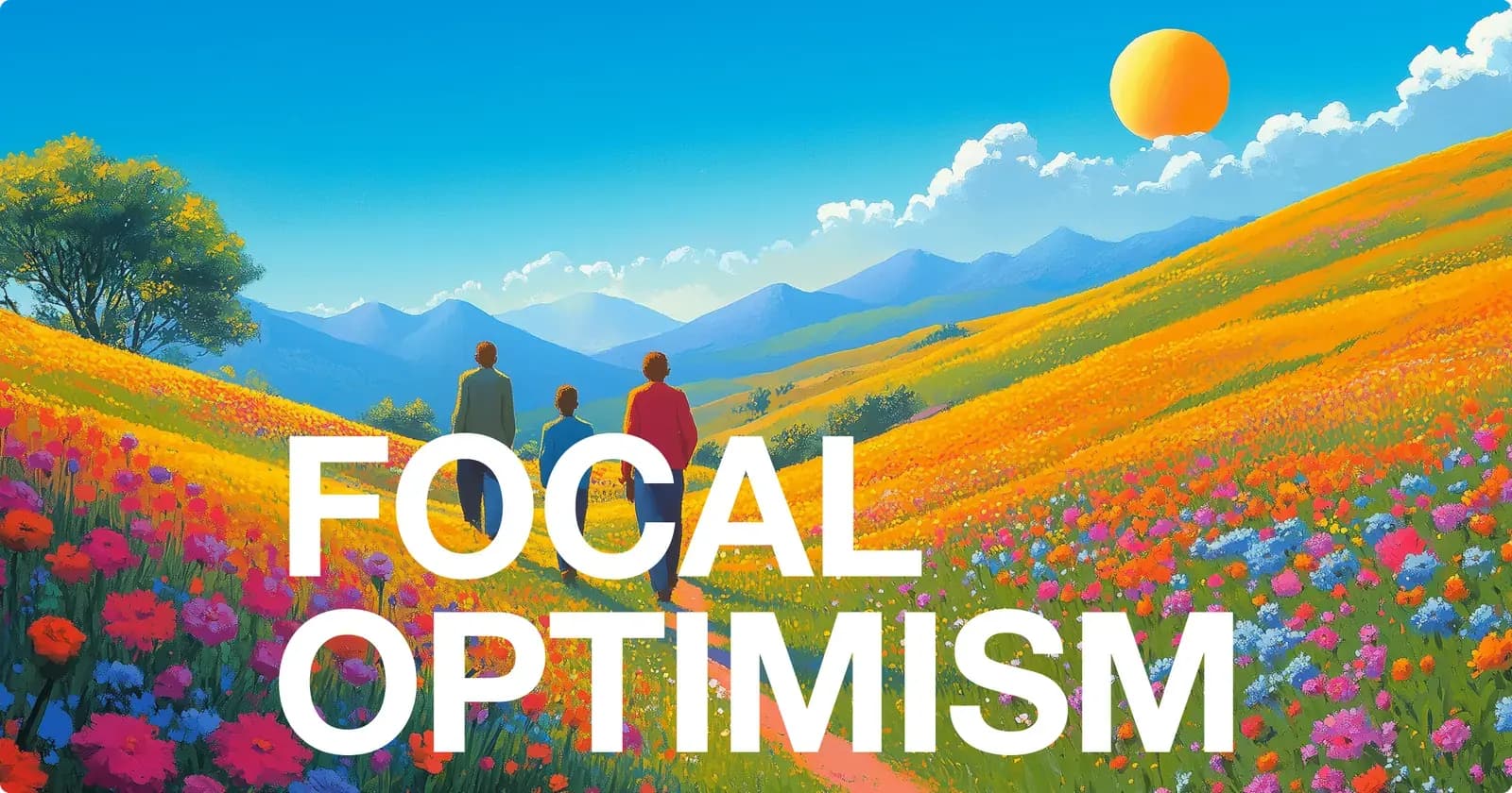
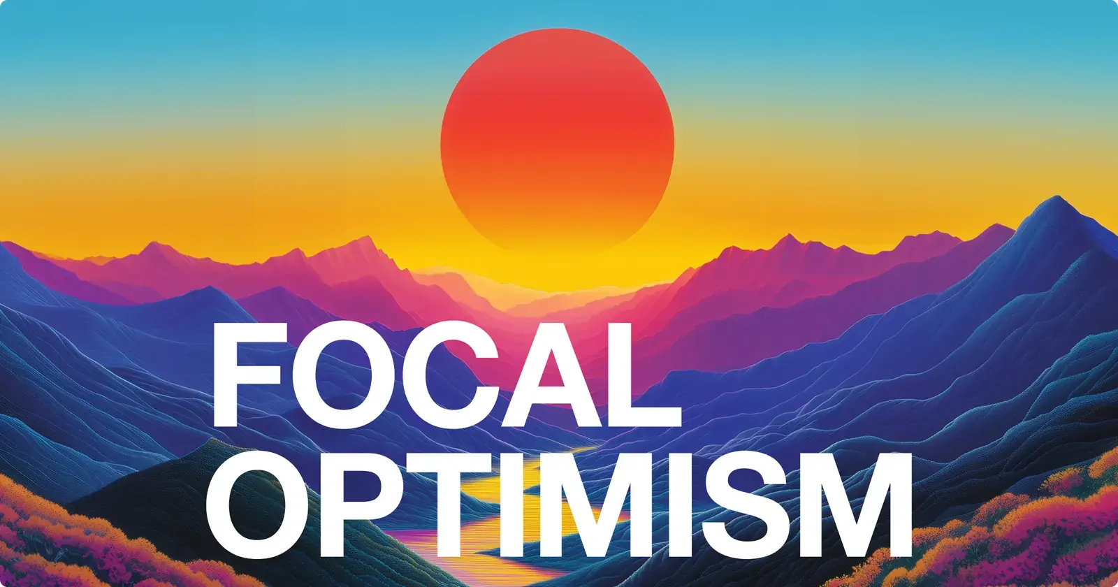
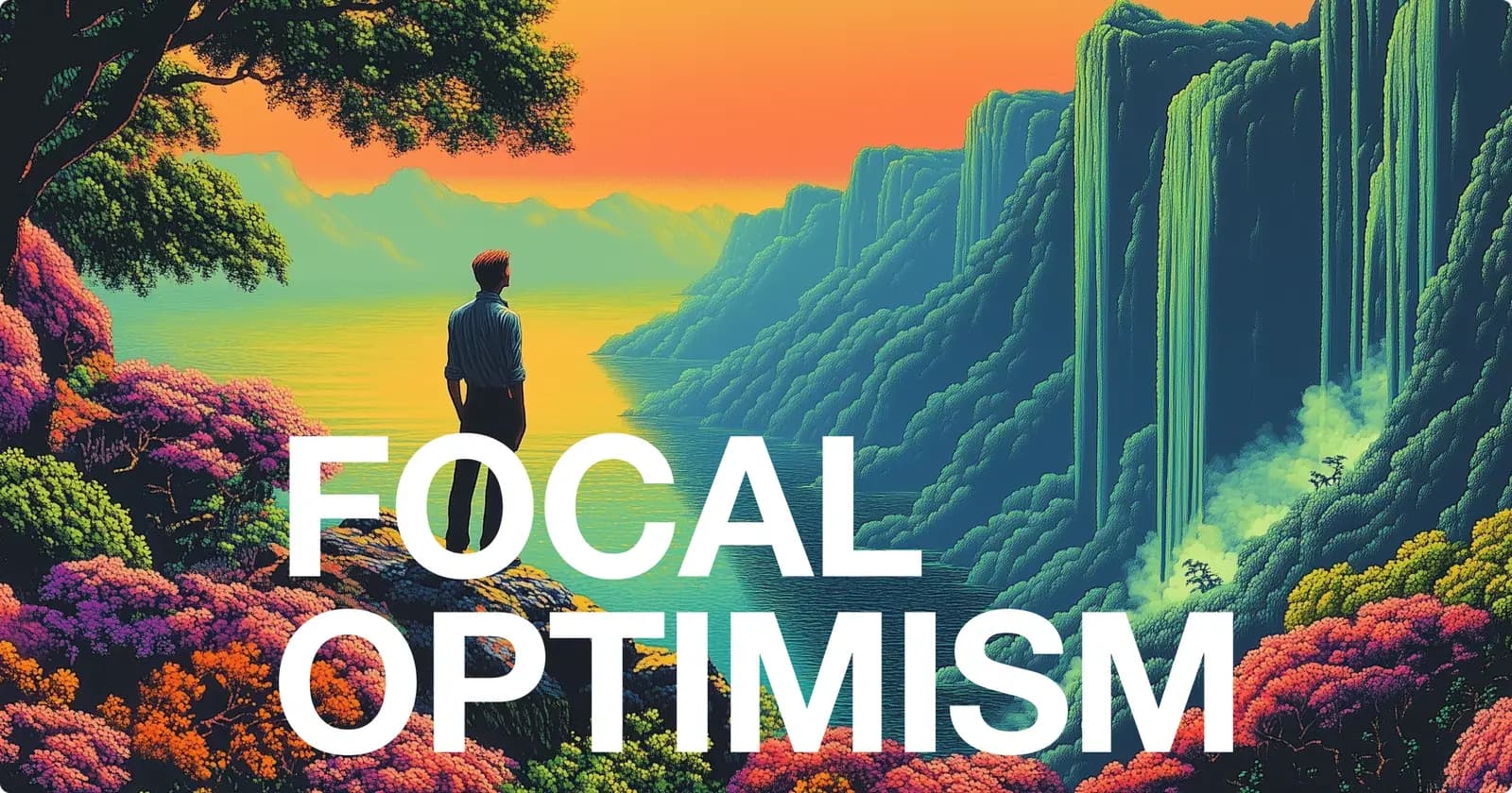
The web magazine ran on monthly themes. An article cover is four fixed slots over a founder cutout in that month's colours.
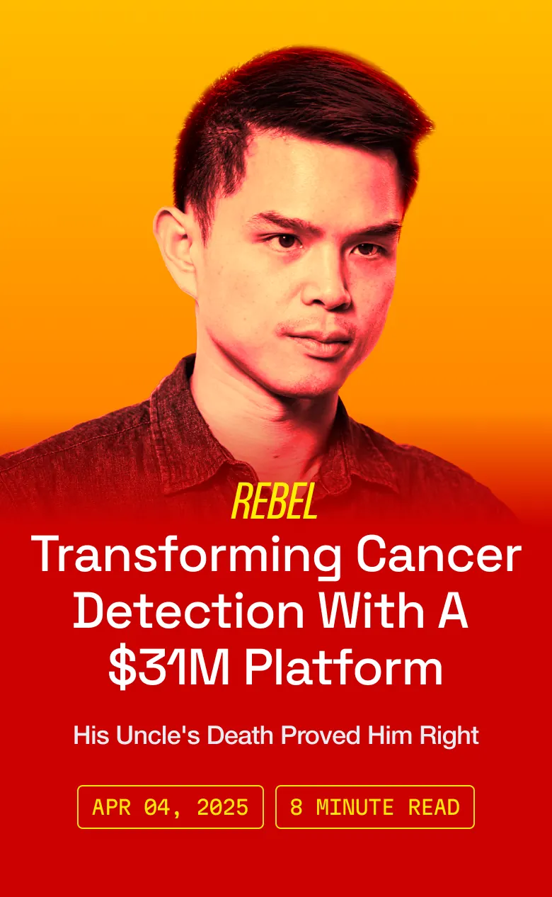
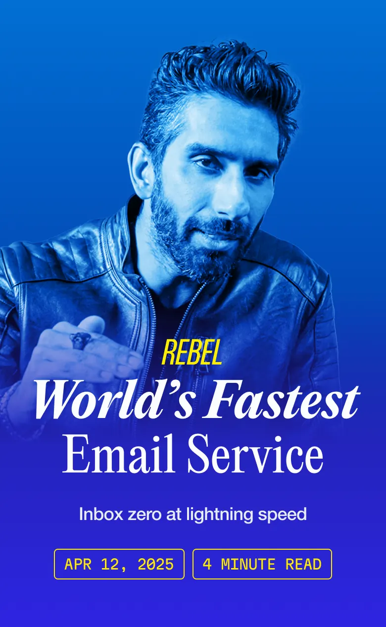
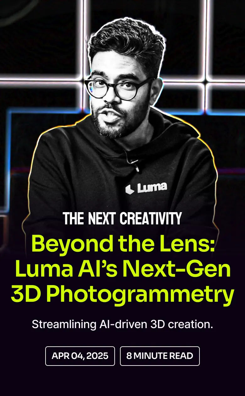
4. Swag
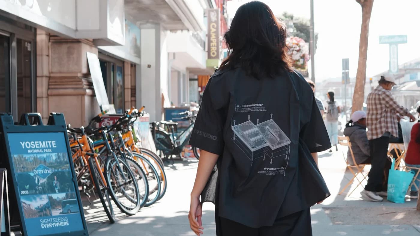
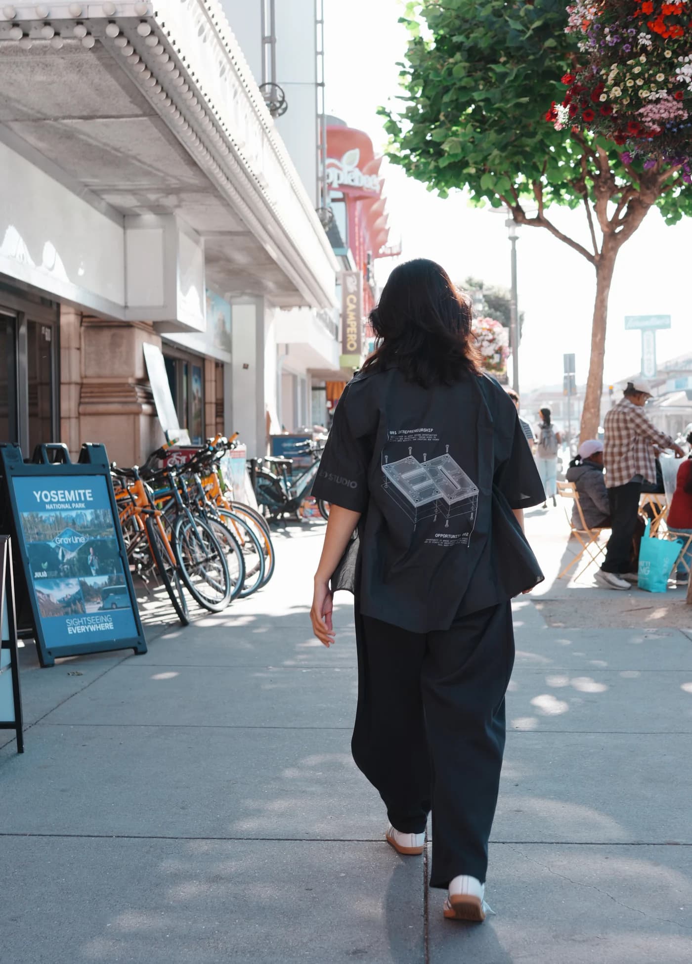
The 2026 uniform: sixty-odd shirts, vendor quotes, a DTF print test. I art-directed the back graphic and the print colour.
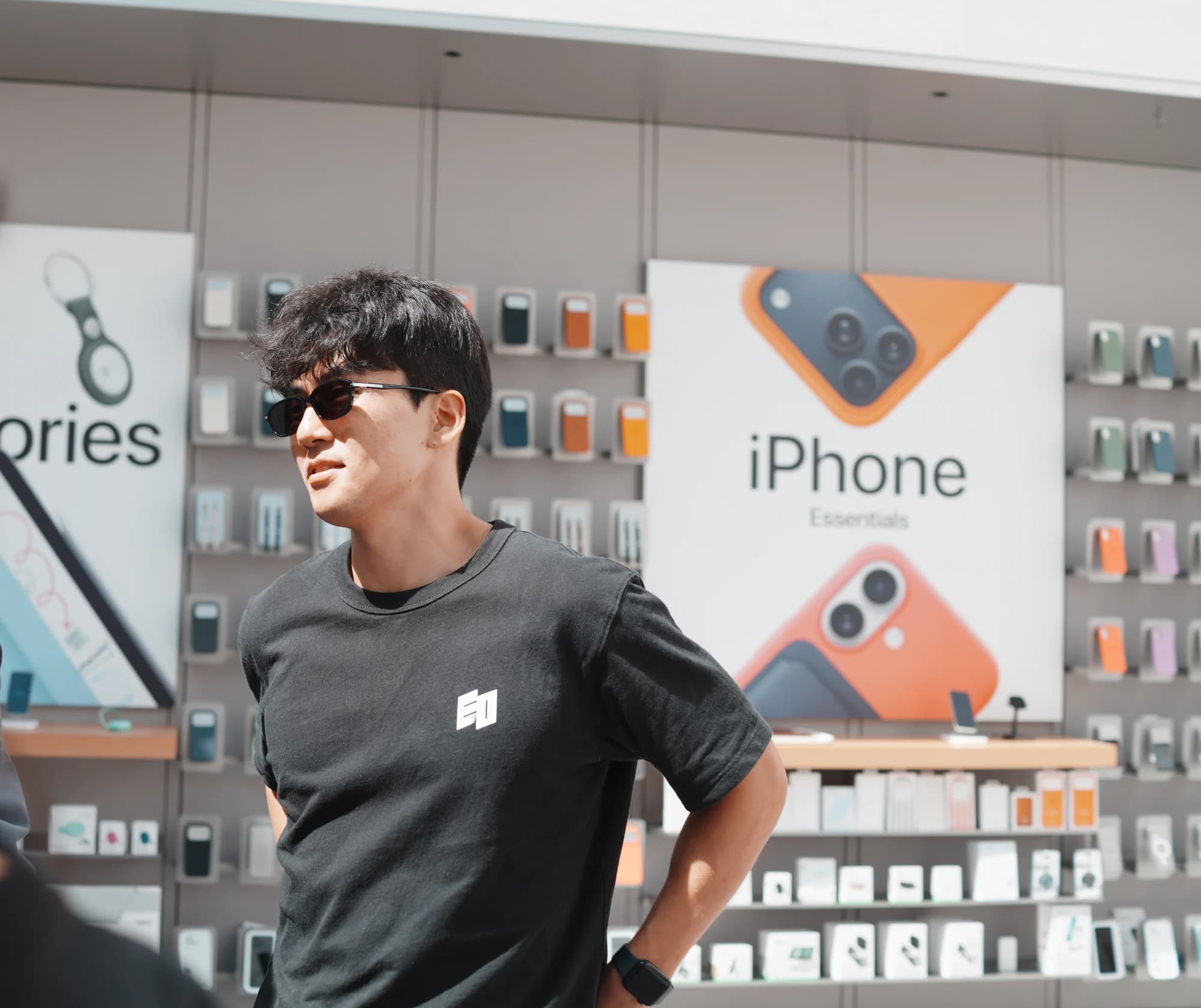
In September 2025 I designed the company tee and sent print-ready files to the vendor.
5. Social
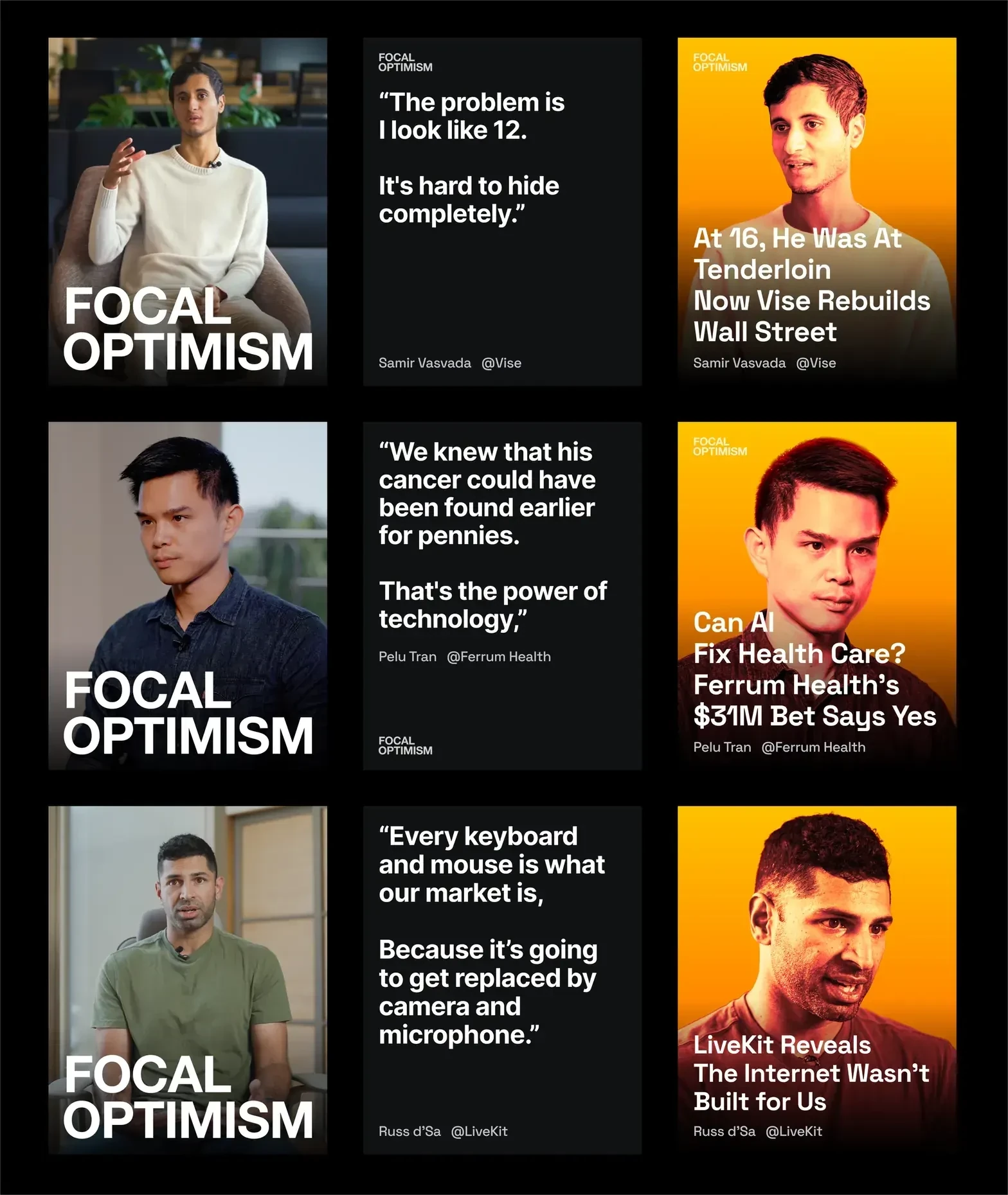
Every interview became a fixed three-card unit: a film still with the wordmark locked bottom-left, a pull-quote card, and a duotone headline card in the month's two colours.
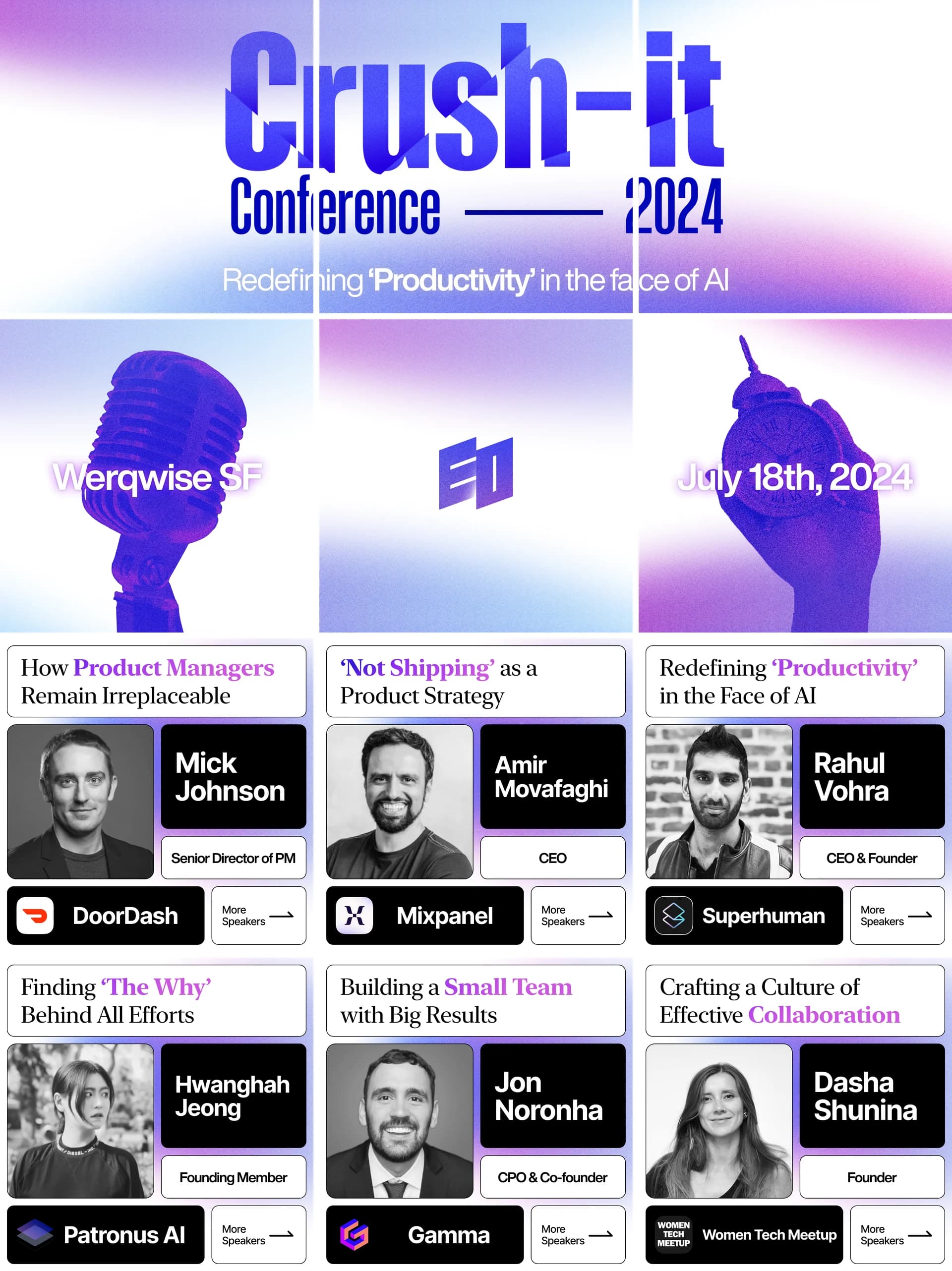
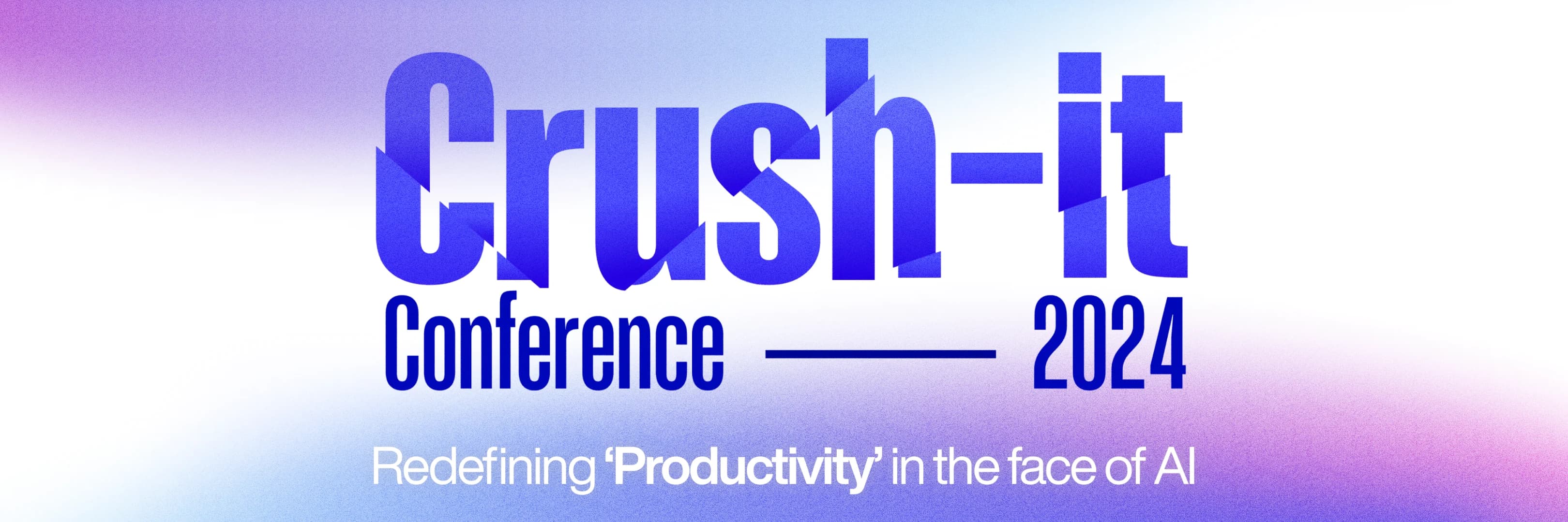
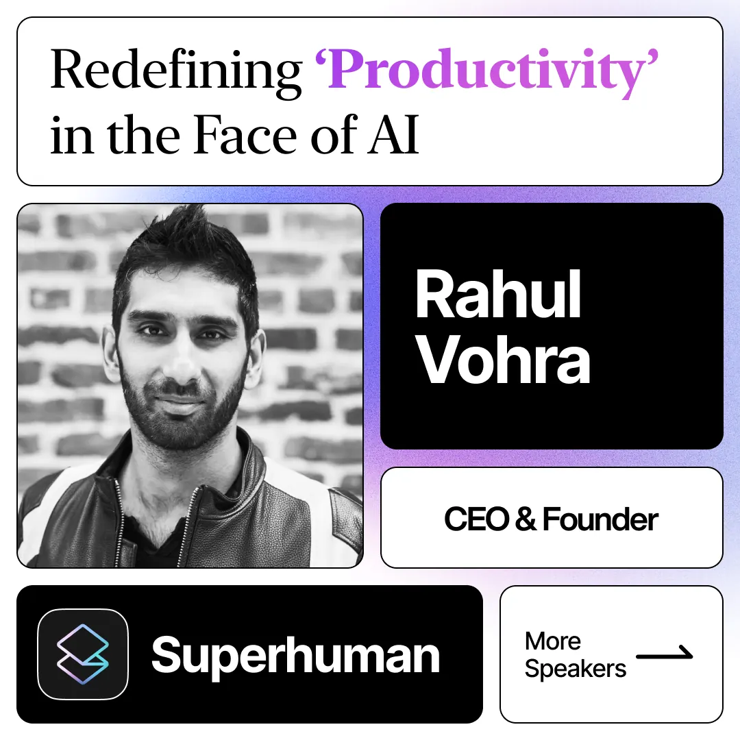
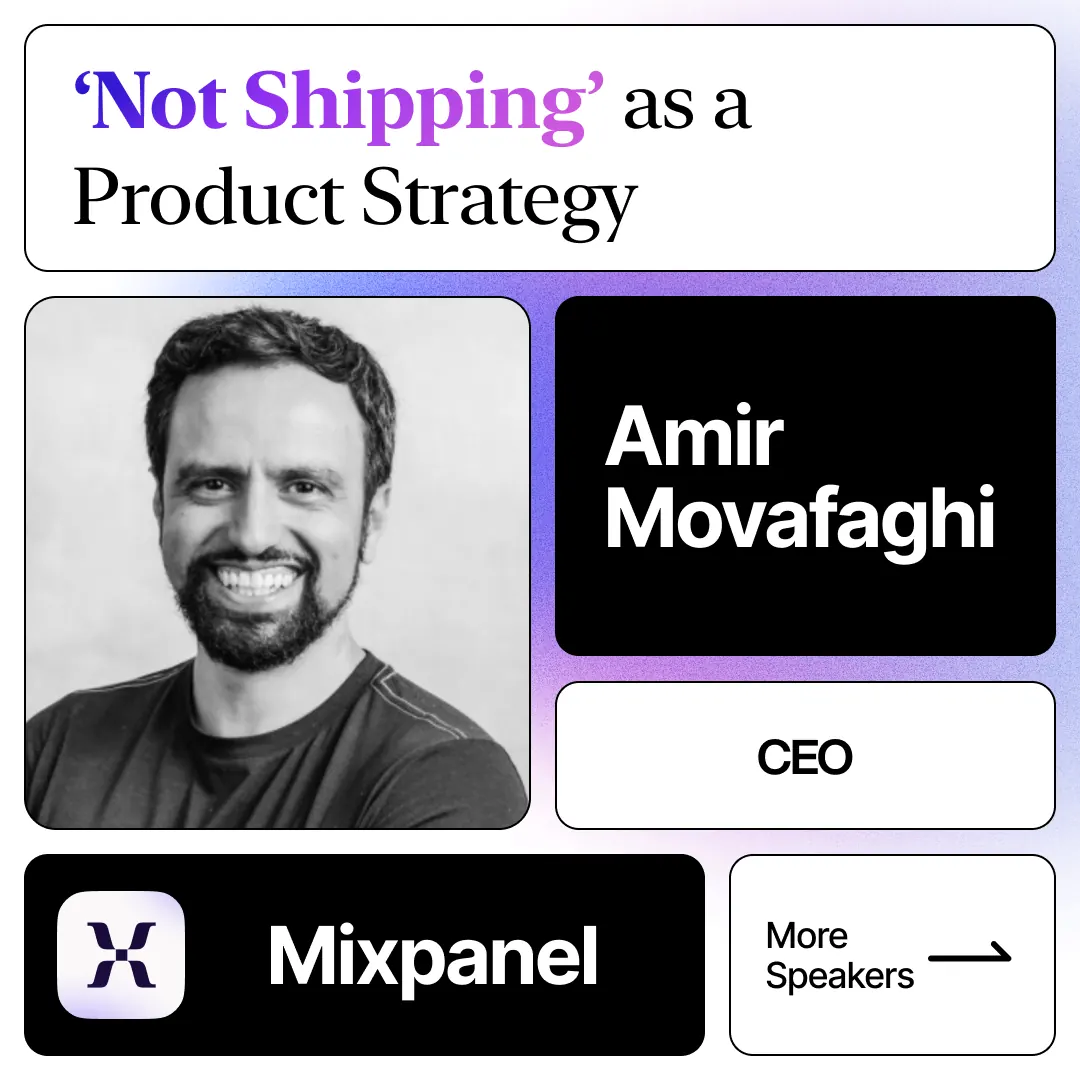
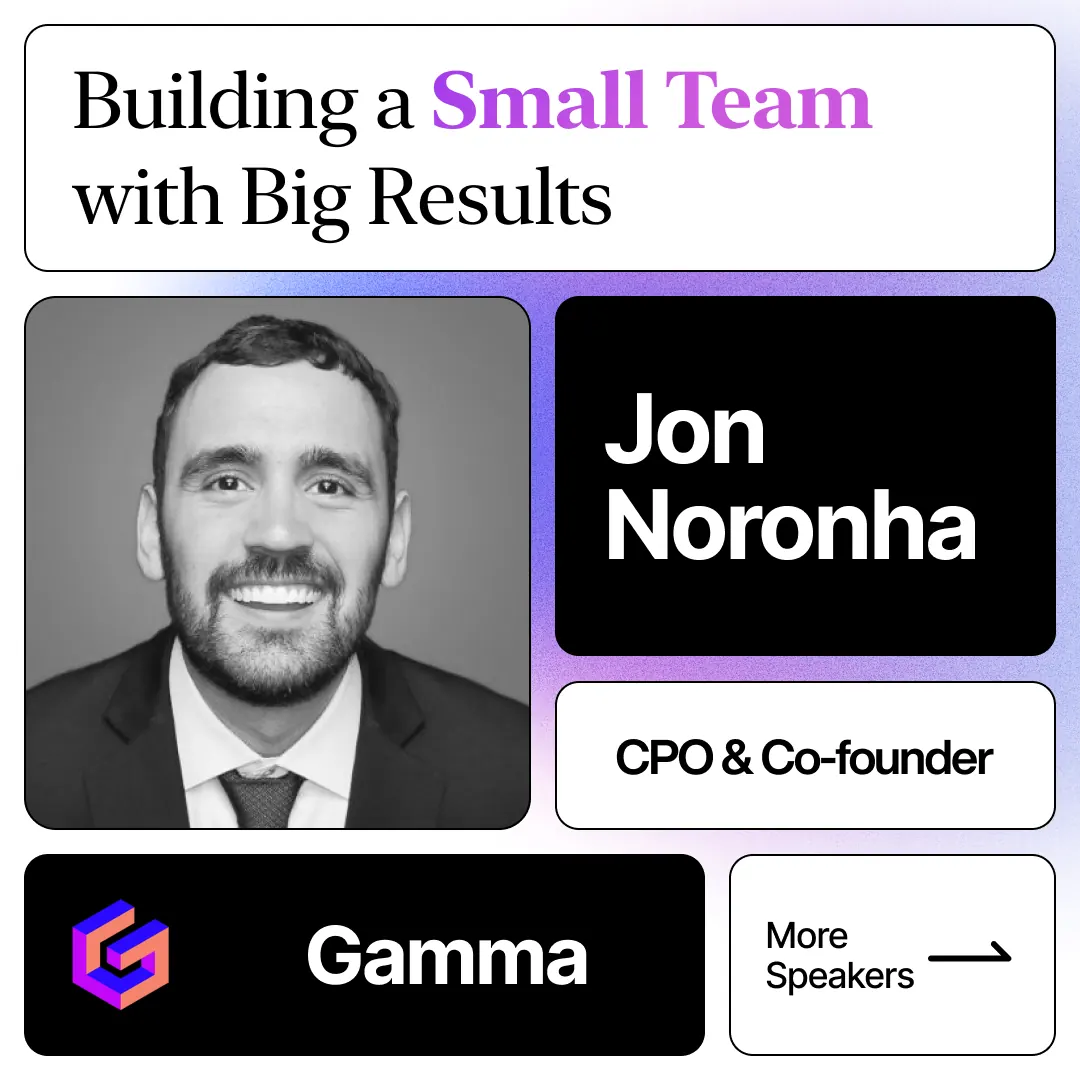
The Crush-it Conference campaign was designed for the profile page, not the feed: one 3:1 lockup sliced across the top tiles, speaker cards on a fixed skeleton below.
Outcome
The component and the post formats keep the output one brand across the global and Korean channels. Both automations run today.