Skip to content

← Work

EO Studio · 2024-2026Web / UX/UI / Brand

EO Magazine

EO's subscription publication. Designer since the first build; I shipped the quote feature.
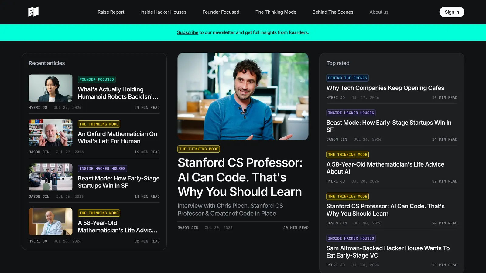
eomag.io front page in dark mode
Role
Product design, front-end
Built with
Next.js, Tailwind CSS

Background

EO is a YouTube company. An interview takes weeks to make and becomes a video you cannot search, quote or save from. The magazine is the same reporting written down: three articles a week on a monthly theme, plus the SF reporting that never fits in a video. It is also how EO sells something directly rather than renting an audience, which makes the reading experience the product.
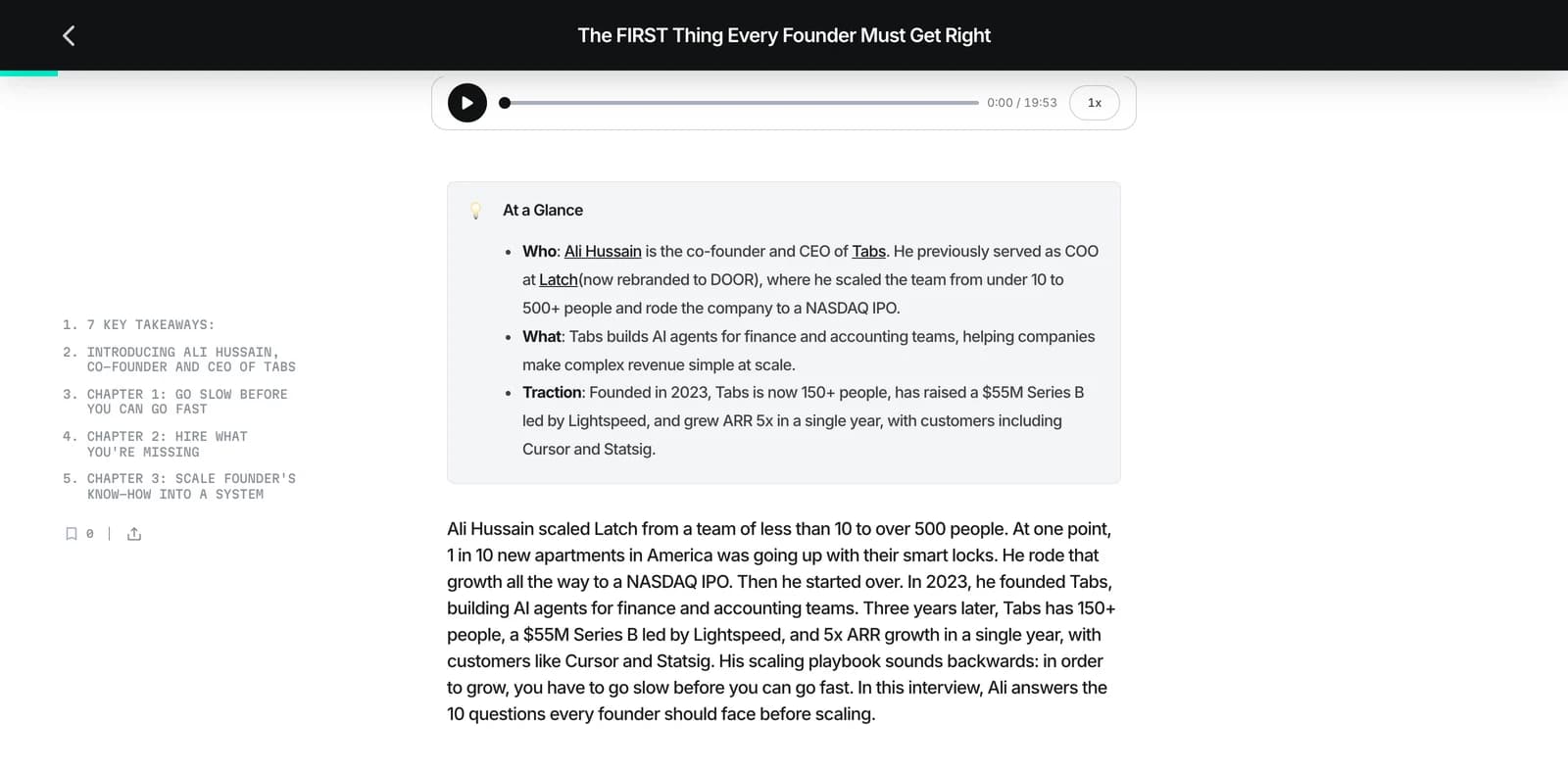
An article on eomag.io: sticky title bar with a reading-progress line, a numbered chapter rail on the left, and the body opening on a key-takeaways list
The reading surface. Chapter rail, reading progress, takeaways before the interview

What I made

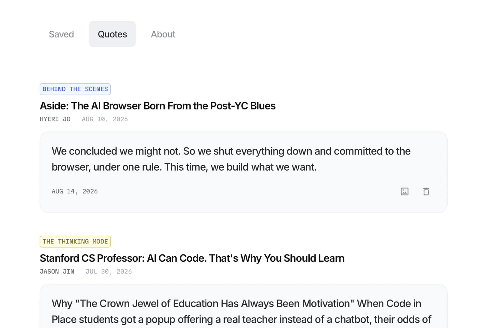
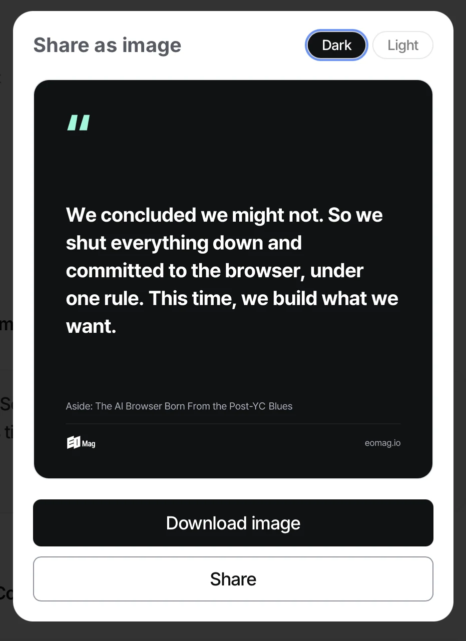
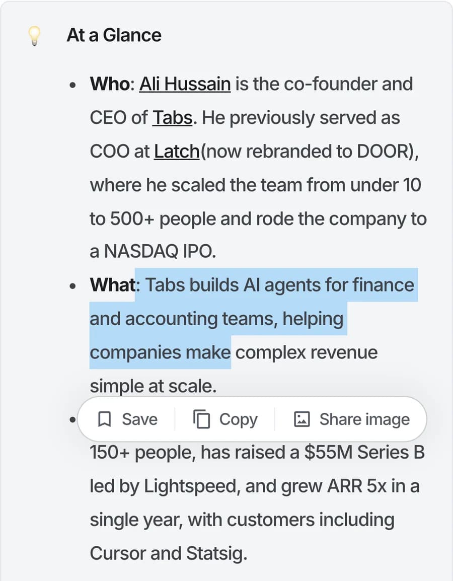
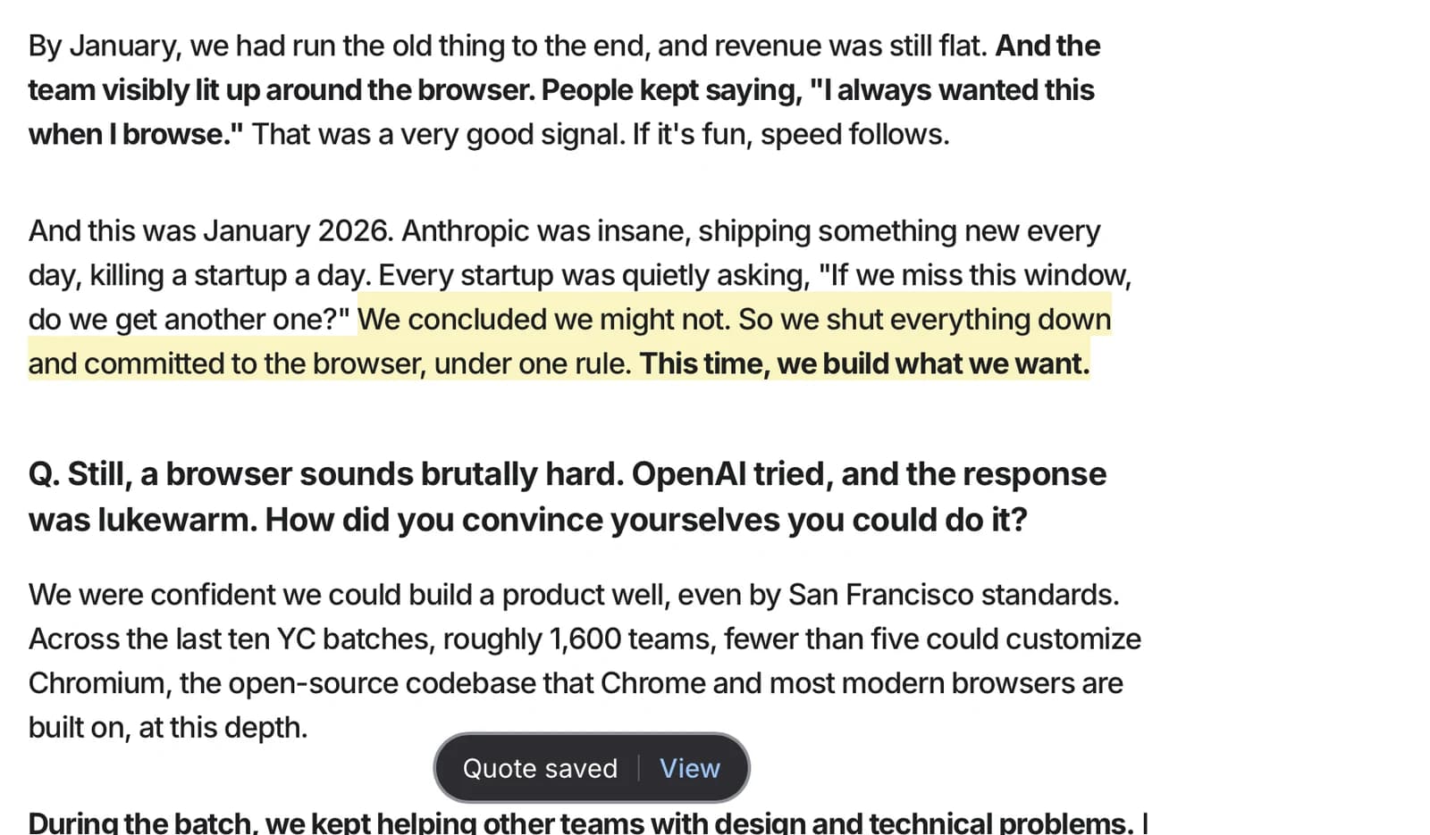
The quote feature. Select a sentence and a toolbar offers Save, Copy, or Share image; saved sentences stay highlighted in the body on every return visit, collect on a Quotes tab in My Page, and export as a share card. It went from a reference note to shipped in production, designed, built and released by me in August 2026.
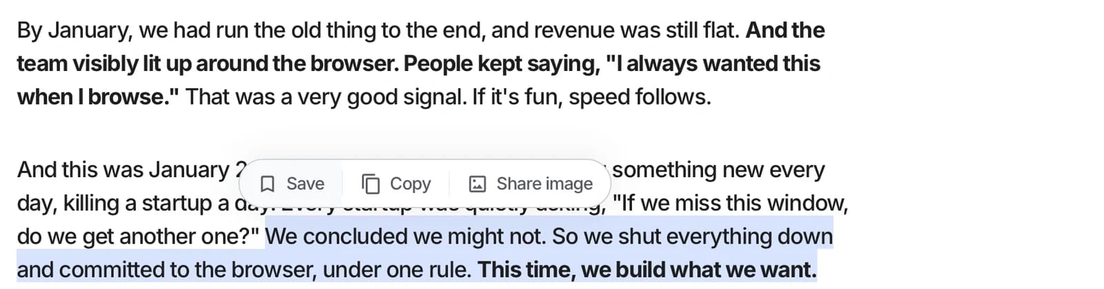
A selected sentence in a live article raising the floating toolbar: Save, Copy, Share image
Select a sentence and the toolbar rises: Save, Copy, Share image
The saved sentence highlighted in the article body, with the Quote saved toast at the bottom
Saved: the sentence stays highlighted on every return visit
The Quotes tab in My Page, saved quotes collected as cards with their source articles
Saved quotes collect on the Quotes tab in My Page
The Share as image modal rendering the quote as a dark card with the magazine mark
Share image renders the quote as a card, dark or light
The same selection and toolbar on an iPhone
The same gesture on mobile

The content IPs

Each show is its own IP with its own type and colour, and the magazine carries them: every category page opens on that IP's identity.
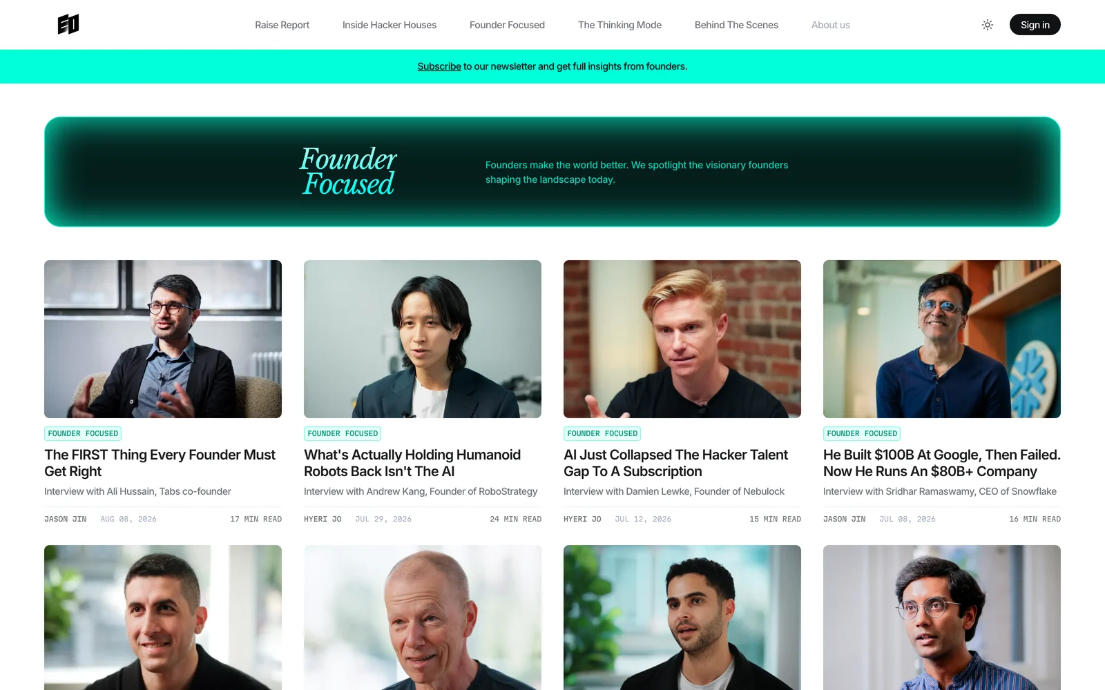
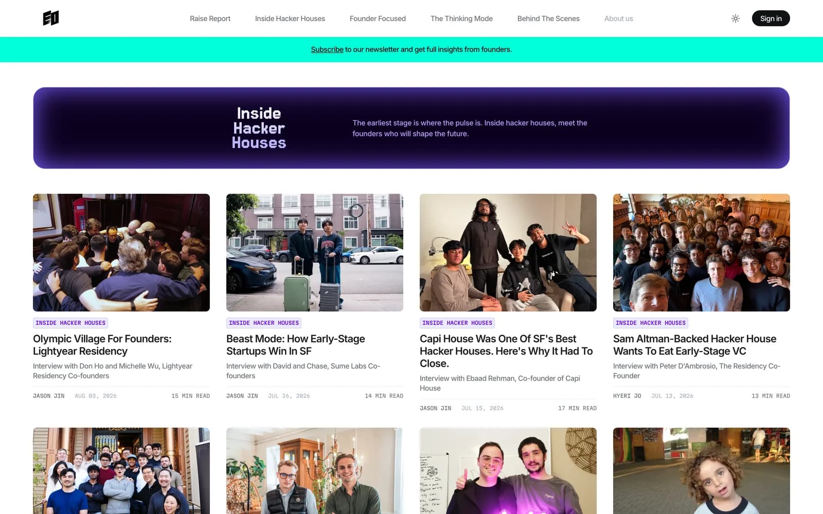
The Founder Focused category page: teal serif identity banner over the article grid
Founder Focused, serif on teal
The Inside Hacker Houses category page: pixel type on a purple identity banner
Inside Hacker Houses, pixel type on purple
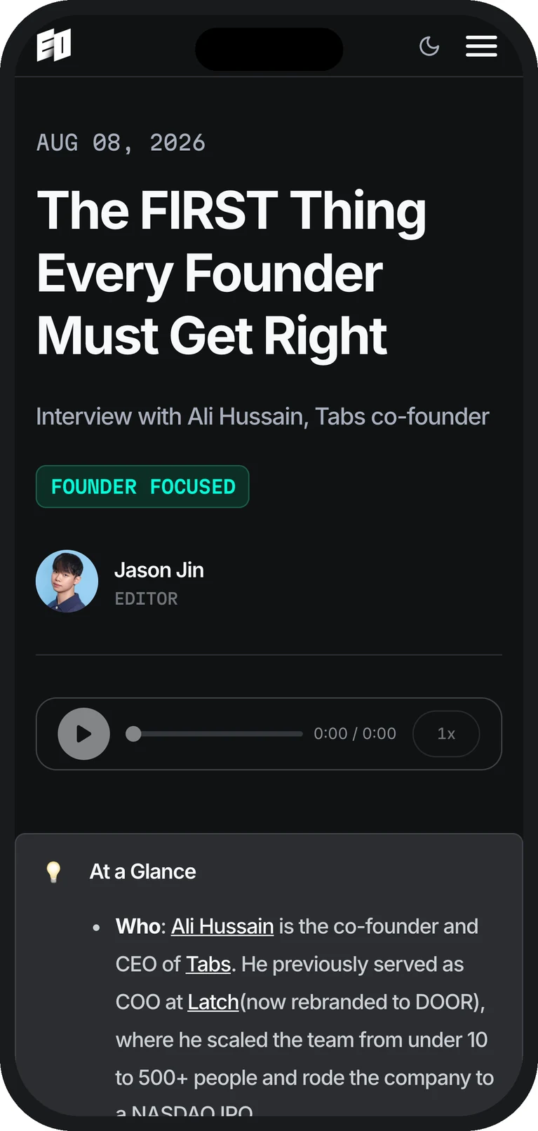
An eomag.io article on an iPhone: dark mode, category tag, byline and the At a Glance summary card
Mobile
The magazine's mid roll, running inside EO Global videos. Sound on.

Outcome

Live at eomag.io, read mostly in the US, and now the surface EO points its video audience at. The design system underneath it is governed from one source file, which is what lets a two-person team keep shipping into it.

Read it live: eomag.io