The problem
EO began in Seoul and expanded its work across markets and formats. Its identity had to make sense in Korean and English, on a channel banner, in motion, in a product, and eventually in a room. The design challenge was not a single mark. It was how to make many teams recognize and apply the same idea without flattening their local work.
The 2026 work moved from concept development into application planning through the summer and fall. A plan for regional rollout is not evidence that every application shipped. This case shows the decisions and working artifacts at their recorded stage.
The call
I led the internal brand process: framing the brief, comparing directions, reviewing partner work, deciding what the system needed to support, and coordinating applications. Taeil Kim / DiceAndFly.Studio designed the identity and its motion language. That distinction matters because direction, authorship, and rollout are different kinds of work.
The screw became a useful organizing object because it joins things through repeated physical action. I kept that fact close to the design. The head can be a recognizable face; the thread can make a repeatable graphic unit; compression can explain motion. When a metaphor asked the flat tip or every part of the object to stand for a new abstract virtue, I cut it back. The identity needed a system people could use, not an anatomy quiz.
The working verbal line is Build Anyway. The current guideline records 그래도 만들자. as the Korean expression. An earlier supplied line, 안 될 싸움을, 해볼 만한 싸움으로., remains a proposed or historical exploration. These are different editorial states, not interchangeable translations or simultaneous official lockups.
The system
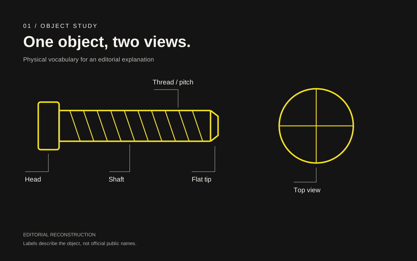
The side view describes a path of repeated turns. The top view gives the system a face. Repeated heads can form a community pattern. Head, shaft, thread, pitch, and tip are explanatory terms in this case, not five public product names. The flat tip stays flat in the current working rule; it does not need a story about reaching a destination.
- 01Positioning and comparison
- 02Partner identity and motion
- 03Guideline rules
- 04Channel and IP applications
- 05Regional rollout review
I used the screw's physical behavior to test the language. The working bridge connected Build Anyway with torque, earned optimism with the helix, and backing with a joint. These were design prompts, not names to print on every asset. Workshop pairings remain proposals unless they appear in the current guideline.
Three rules organize the application planning:
- Type: Founders Regular, Medium, and Mono with Pretendard for Korean. One hierarchy has to work in both languages.
- Color: the current guideline's Space Black is
#000000. For print, I proposed an sRGB reference → CMYK veto → Pantone proof → final CMYK sequence. Vendor proofs are still needed to verify that process across countries. - Motion: compression and repeated turns come from the same geometry as the static identity. The motion should explain the form.
In the world
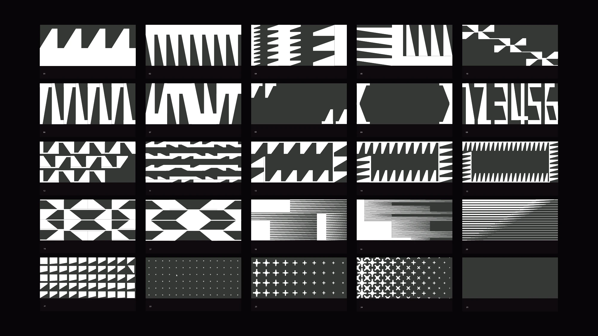
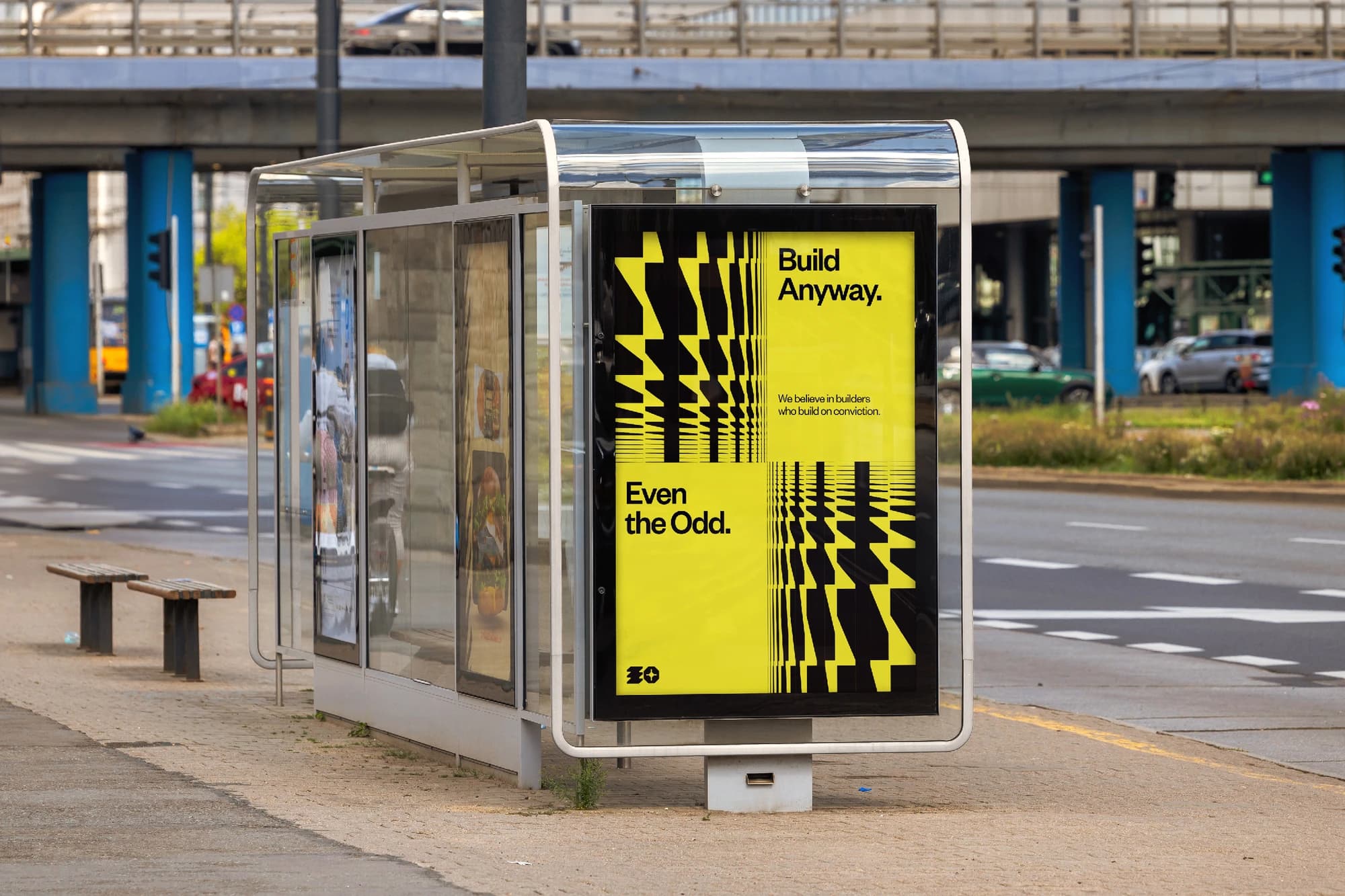
The system had to reach channel art, logo motion, media identities, and physical applications. I asked for alpha-background logo variants that could be tested over real content, discussed motion-poster uses, and requested pattern-generator presets. EO Magazine, EO School, and IP work such as ODDS and BUILT create distinct application contexts. A named scope is not a claim that each one has a finished, released asset. Climb and other names in earlier planning require a dated check before being presented as current IPs.
The proposed physical layer includes a prop, guest kit, and event ritual. “Even Screw,” “첫 나사,” and “Odd Screw” mark different proposed roles in that narrative, from primary object to first-action ritual to community signal. They are working names, not official product lines or merchandise. The supplied frame, “the screw is the builder; EO supplies torque,” is likewise a narrative proposal rather than guideline copy.
Outcome
The recorded work established a working verbal and visual direction, partner motion reviews, application requirements, and a phased regional rollout plan. Those are design and coordination outputs. They do not prove universal adoption or a completed launch. The supplied count of 39 deliverables needs a dated tracker that separates scoped items from finished files.
[[METRIC: brand rollout coverage]] [[METRIC: confirmed rebrand deliverables]]What I'd tell another designer
Use the object's real behavior to make decisions. When an analogy begins to explain everything, it stops helping the people who have to make the next asset.